Brief: Design an iOS app that helps improve restaurant dining experience by offering an easy to navigate menu.
Role
UX Researcher
UX Designer
Design Thinking Framework
Empathize
User Interview
Empathy Map
Define
Personas
Ideate
Generate Big Ideas
Brainstorming
Prototype
Wireframing
Test & Iteration
Usability Testing
The Problem
Challenge To Overcome
One of the biggest complaints restaurant owners receive from customers is poor service from wait staff. Bad dining experience frustrates restaurant goers, which directly impact the business’ sales and reputation.
Process
1. Empathize
Discovery: Research & Analysis
A video semi-structured interview was conducted with 3 individuals to find out about their past dining experience.
The study found that all participants think that a smooth ordering system is more important than having wait staff being attentive to them. Traditional paper menu has limitation and often makes ordering a difficult task.
Pain Points
Hard to find items on big menu
Extra time spent on looking at menu for people who has dietary restrictions.
Add layer of work to communication with wait staff on complex order
Human error when placing order
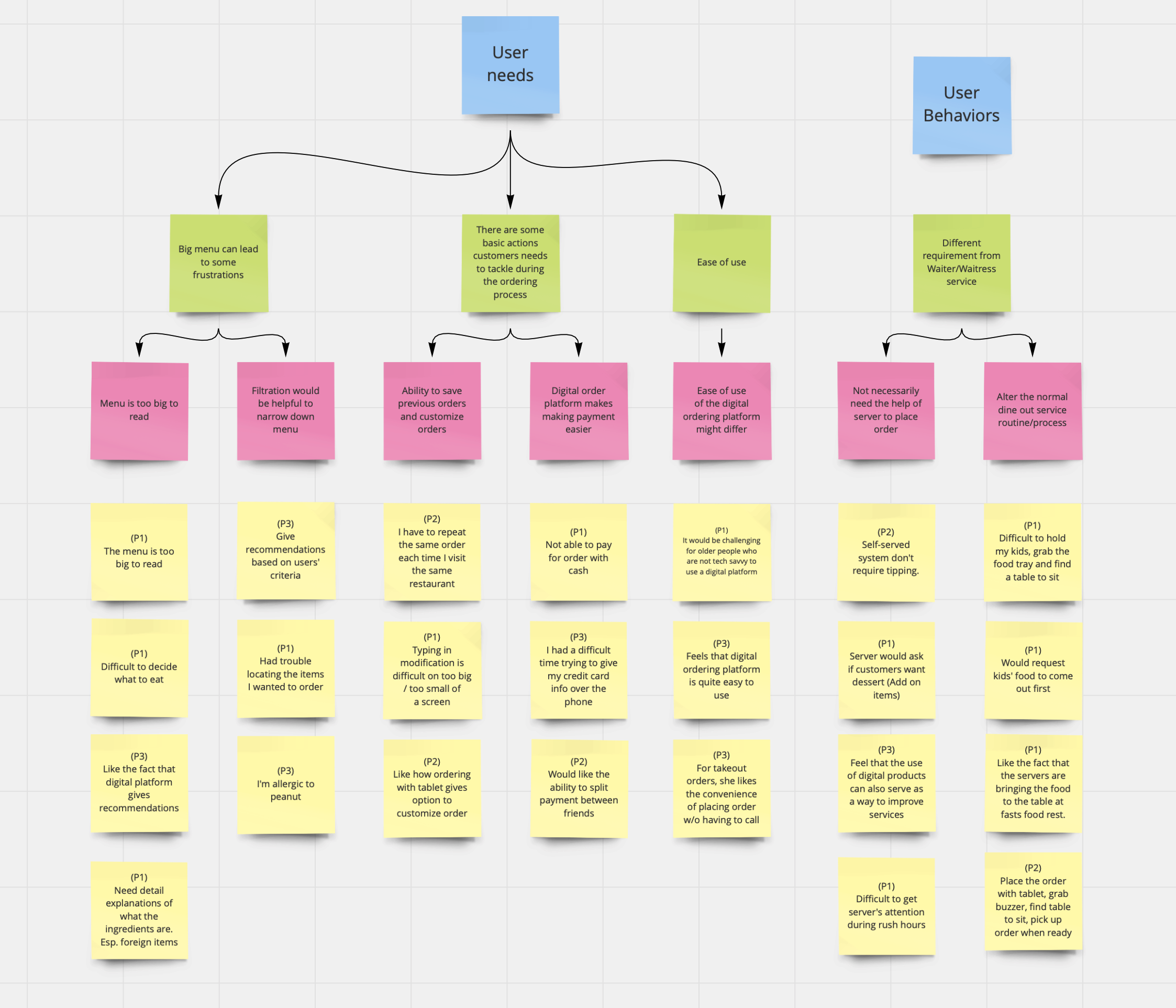
Empathy map
Empathy map was used to determine what a customer would say, do, think, and feel with the given scenario. My results were grouped by four main areas to focus on. While focusing on several pain points, I integrated these insights into my design.
How might we ease the frustration user has due to the overwhelming information on the menu
How might we assist the user during the ordering process
How might we make a digital ordering platform easier to use
How might we normalize the use of dine in ordering app instead of traditional human to human service.
2. Define
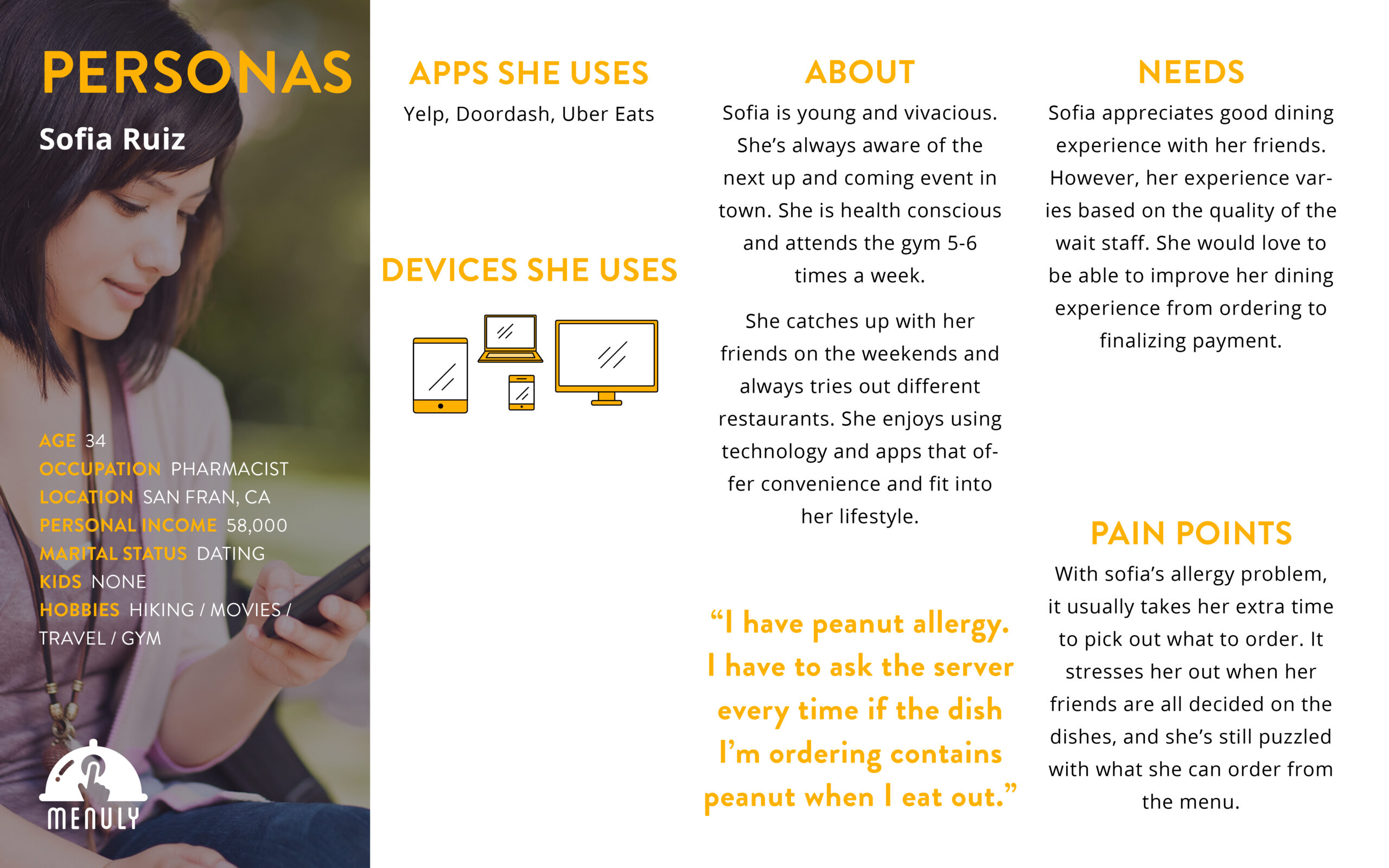
Persona
With the survey data, I have determined the top needs of our users. I have created and a persona based on the data I collected during the user interview.
Design
3. Ideate
Design: Concepts & Sketching
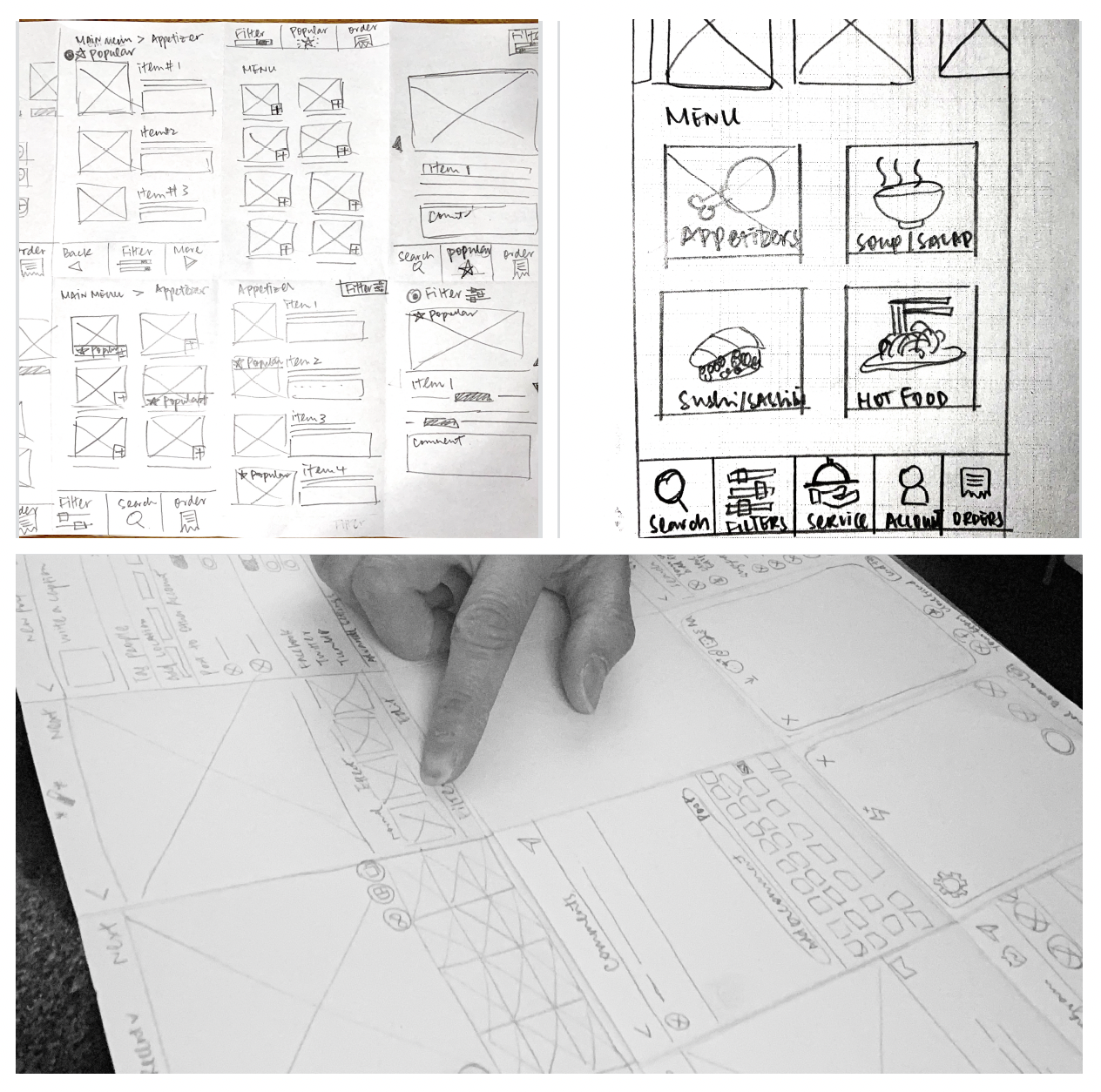
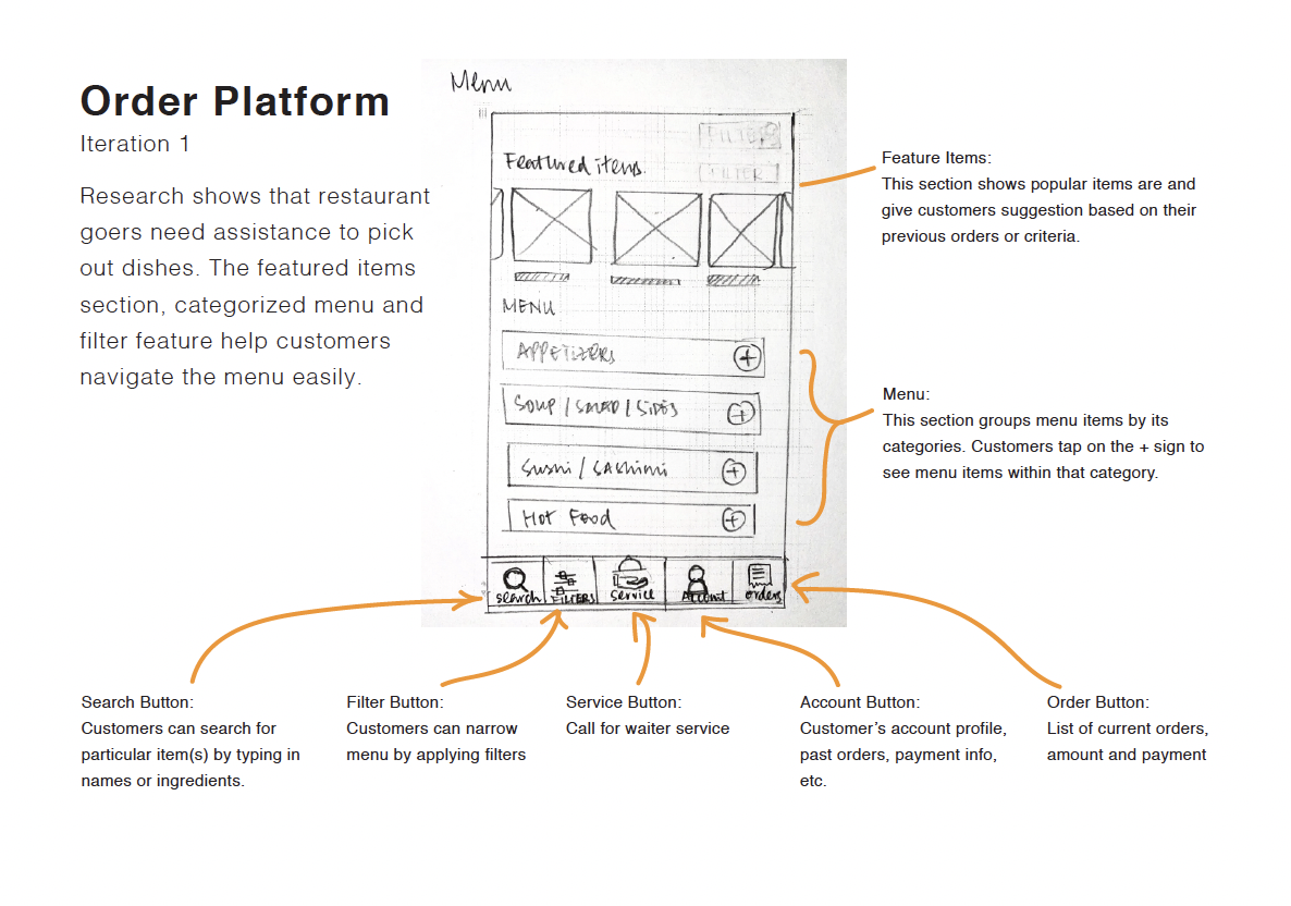
Lo-Fidelity Wire-Frames
The findings have helped me shape the direction of this dine-in food ordering platform. Here are some recommendations.
The dine-in ordering platform will provide filtering function for easy item location and narrowing options
It’s important to provide recommendation.
Ability to customize orders
Provide different payment options (Including check splitting)
Platform has to be easy to use.
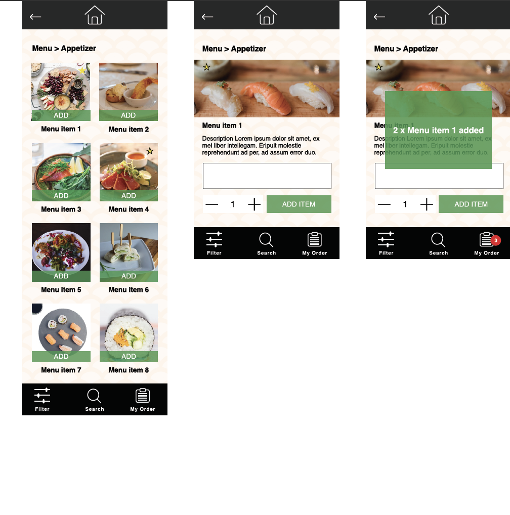
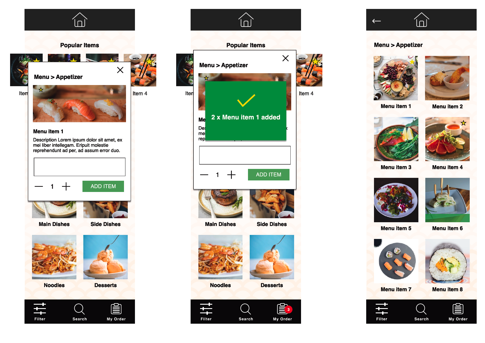
4. Prototyping
Some keys functionalities are added to the prototype. The main goal is to create an easy to navigate menu with filtration, customization and search function.
Testing
5. Test
Validation, Usability, Feedback
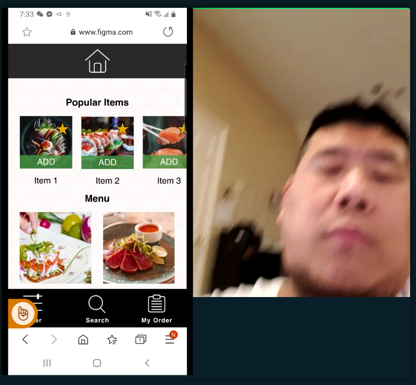
5 Users were recruited for a usability test which was done via Lookback.
Good things
• Easy to navigate, straight forward
• Picture size is good, makes choosing items easier
Things to consider and need to improve
• Didn’t like how it needs to be logged in to place order
• Remove “Add” buttons. Most of the users didn’t use the “Add” button to add item directly, they would click on the food photo and enter the detail description page before adding item.
• Some think that the header is a bit big, making the main interface too small to view content.
• Some users didn’t know they could swipe left to view more items in the popular item section.
Further Iterations
6. Ideate & Prototype again
Base on the feedback, I attempted to decrease the time on task by making item detail page a pop up instead of going to a separate view.
By showing the preview pictures on left and right scroll makes it clear to the users that there are more content to the right of the screen.
Impact Overview
With the easy to navigate and core functionalities, like filtration, search and customization, customers can make decision on what food to order quickly. It can also decrease human errors during order taking and increase the service quality.