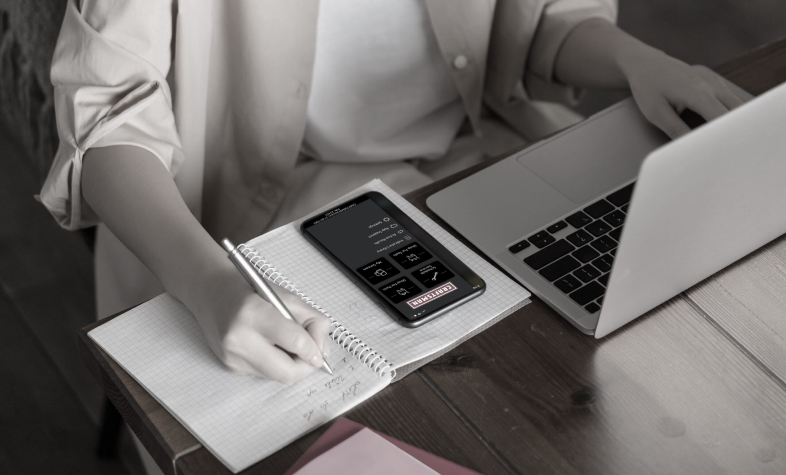
An app that would alleviate driver frustration and anxiety by helping them understand dashboard warning lights and providing options to get back on the road.
Many drivers do not understand the meaning of dashboard warning symbols, the basic automobile repairs, the cost associated with it, and where to go to take care of the issues.
39%
of all drivers were unable to recognize the tire pressure warning light
50%+
of drivers feel that they’ve been overcharged by a mechanic when getting their car fixed.
75%
of young adults believe that their lack of automobile knowledge makes them an easy target to be scammed.
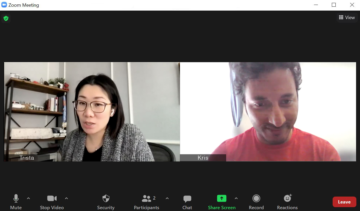
Conducted a one-on-one user interview to learn about user's behaviors.
User Stories
Created five user stories for the AR scanning feature.
Usability Testing
Conducted a moderated usability test with a user to validate the design, find issues, and ensure ease of use.
Screens Design
Created sketches, low-fidelity mockups, and high-fidelity prototypes.
Design Library
Built a design library improved the efficiency of user interface design and ensured consistency.
Design Process
Following this design process allowed the team to make research-informed design decisions and create a user-centered product.
Following this design process allowed the team to make research-informed design decisions and create a user-centered product.
Research
User Interviews
Competitor Analysis
Define Product
Epic & User Stories
Product Workflow
Design
Sketching
Wireframing
High-fidelity Comps
Branding
Usability Test
Prototype Refresh
Research
The team conducted user interviews and feature-based competitive analysis during the research phase.
User Interview
Five users were interviewed via Zoom. The goal is to recognize users’ pain points, needs, and mental models.
Key Takeaways:
Most of the interviewers used online search engines or brought to their social media platforms to find out what alert symbols mean.
When faced with automobile issues, all users would prefer to seek help from a professional rather than trying to fix the problem themselves.
All the users mostly spent their time on social media when using their mobile phones.
Competitor Analysis
We have done a feature-based competitive analysis of competitors’ products. We looked at what they did right, sought any gaps, and found areas we can improve.
Key Takeaways:
Need a more straightforward onboarding process.
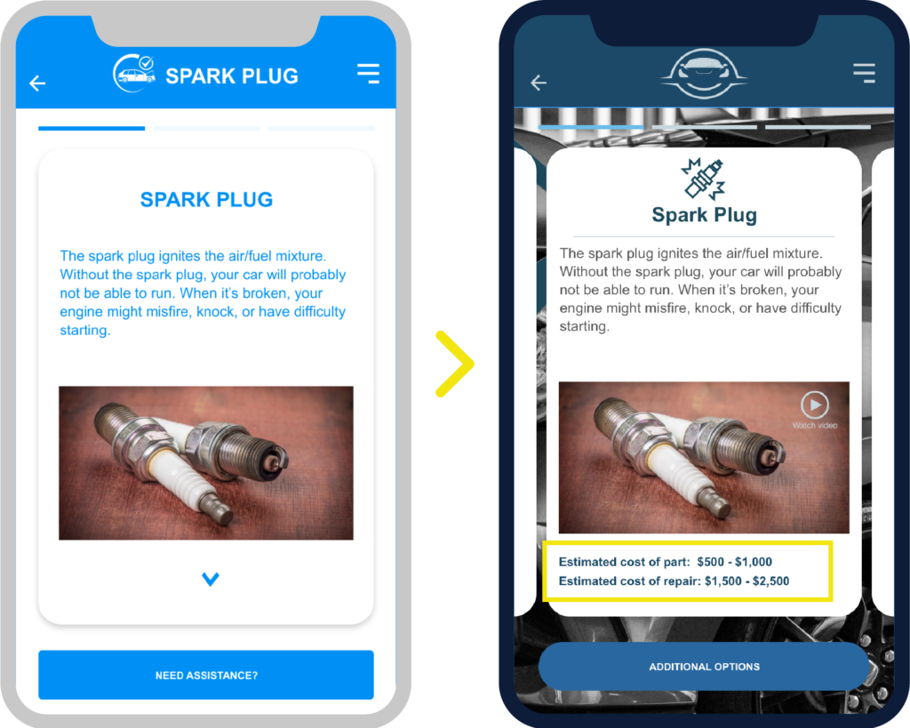
Need to provide more information/options for solving car issues. Competitors only offer information on local shops.
Competitors’ apps provided easy-to-understand price ranges given for the basic issues.
Define Product
Defining the product helped us think things through, develop a shared understanding across team members, and keep things consistent.
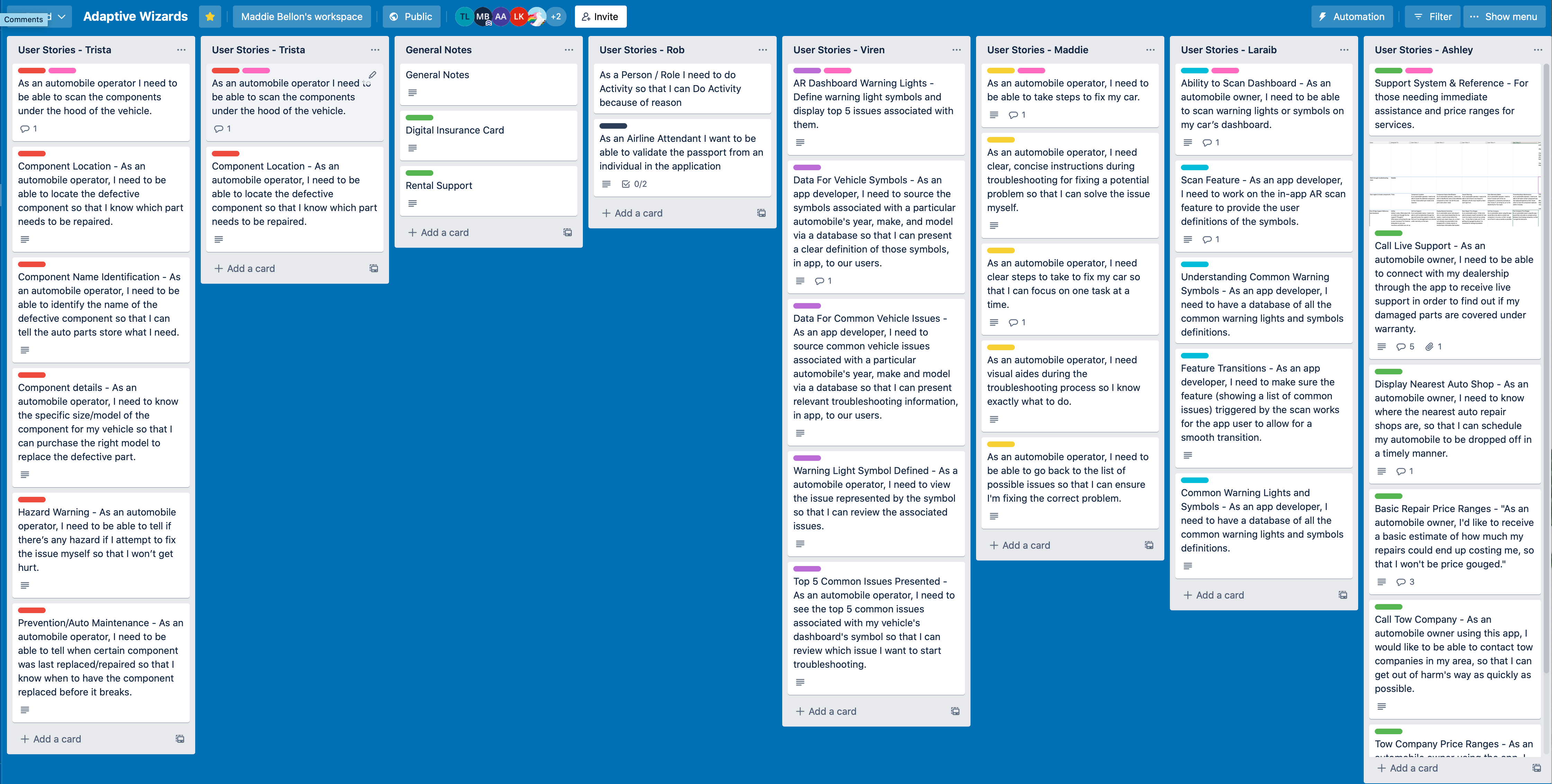
Epics & User Stories
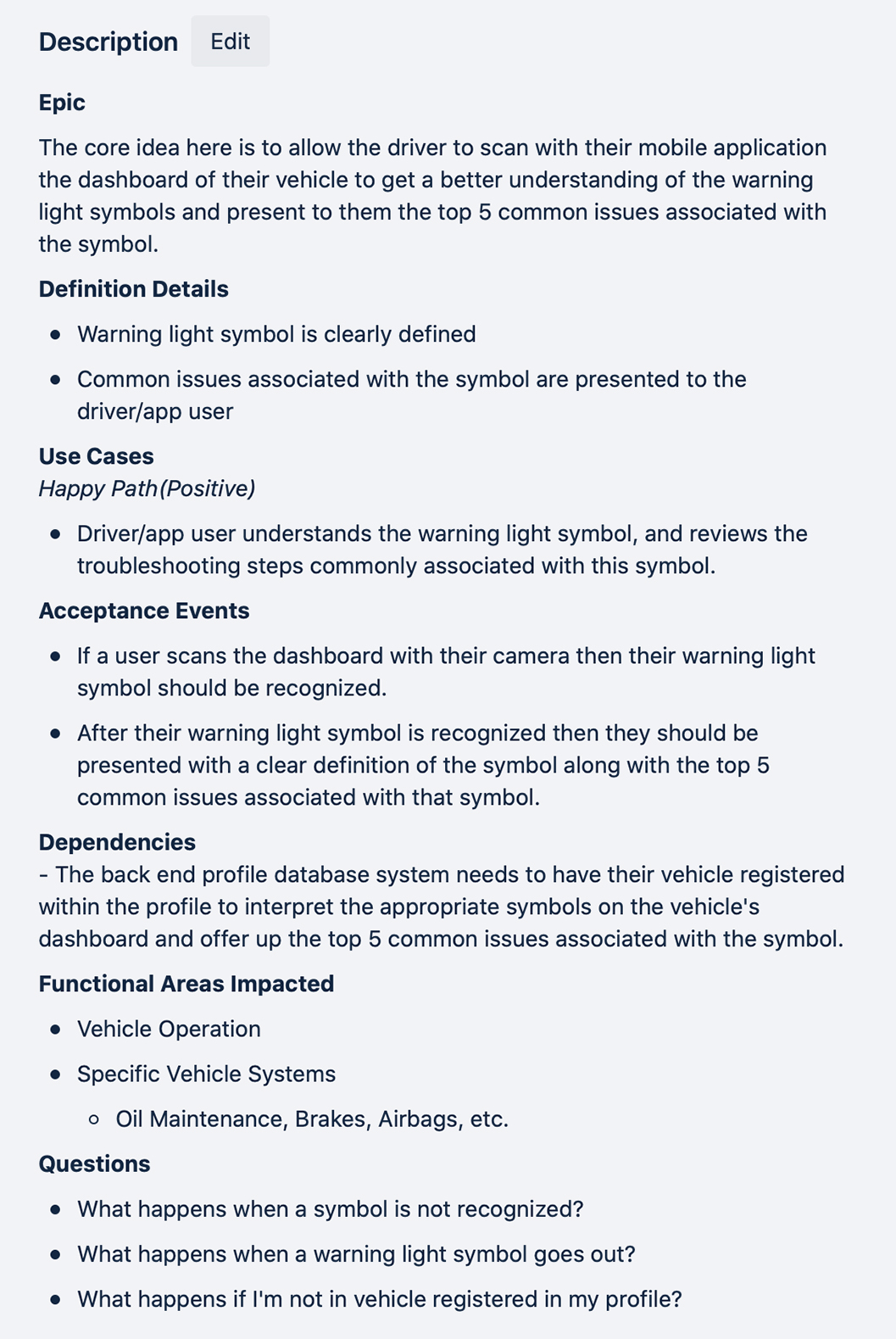
The primary function of creating epics and user stories is to ideate features based on product definition. An epic sets a theme of related product features, while user stories contain details to design and develop. We used Trello to work on this phase.
Epics
Our team came up with 5 epics.
User profile setup
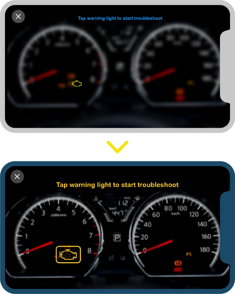
Scanning dashboard using the AR capability
To define warning light symbols.
Display the top 5 issues associated with the symbol
Provide additional assistance
User Stories
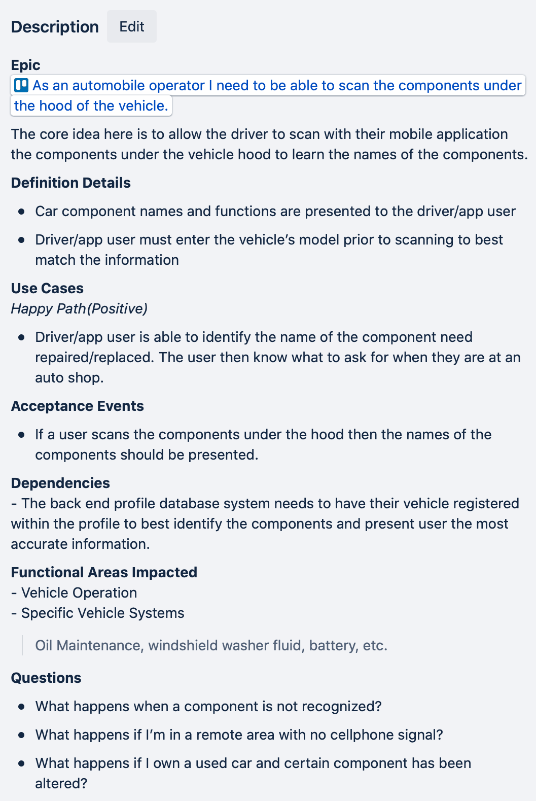
Each team member worked on 5 different user stories for the assigned epic. Each user story would include the following details:
Definition details
Use cases
Acceptance events
Dependencies
Functional area impacted
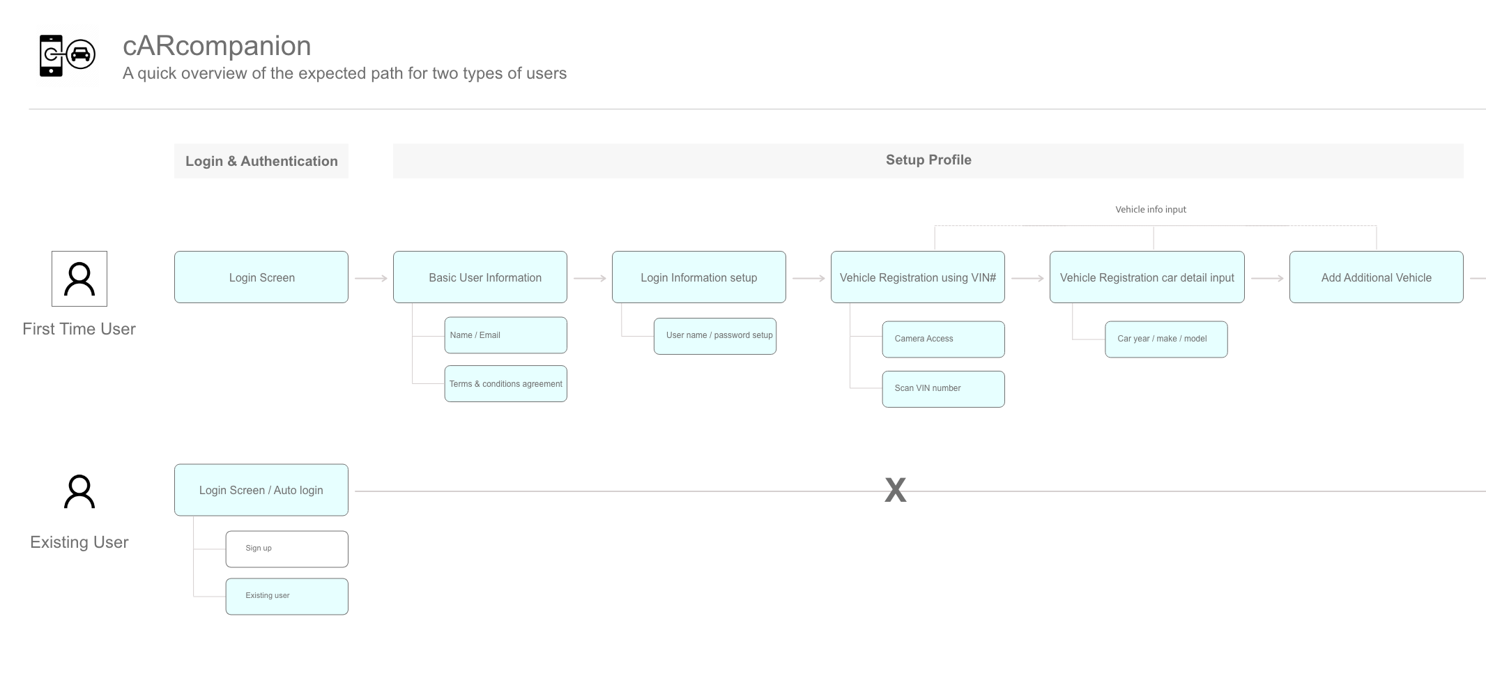
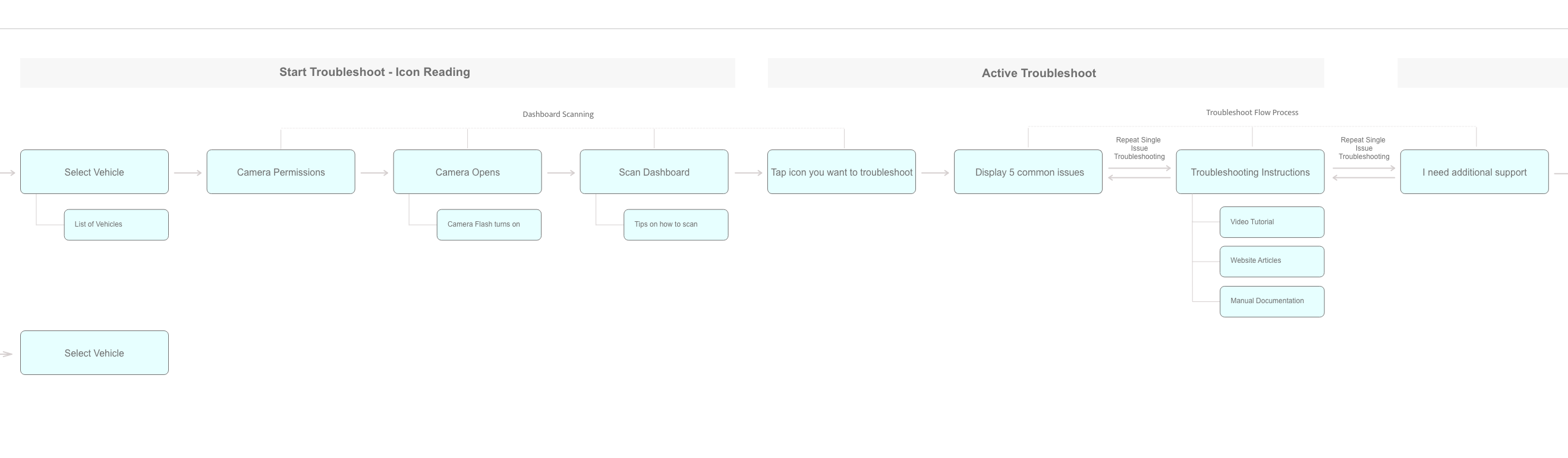
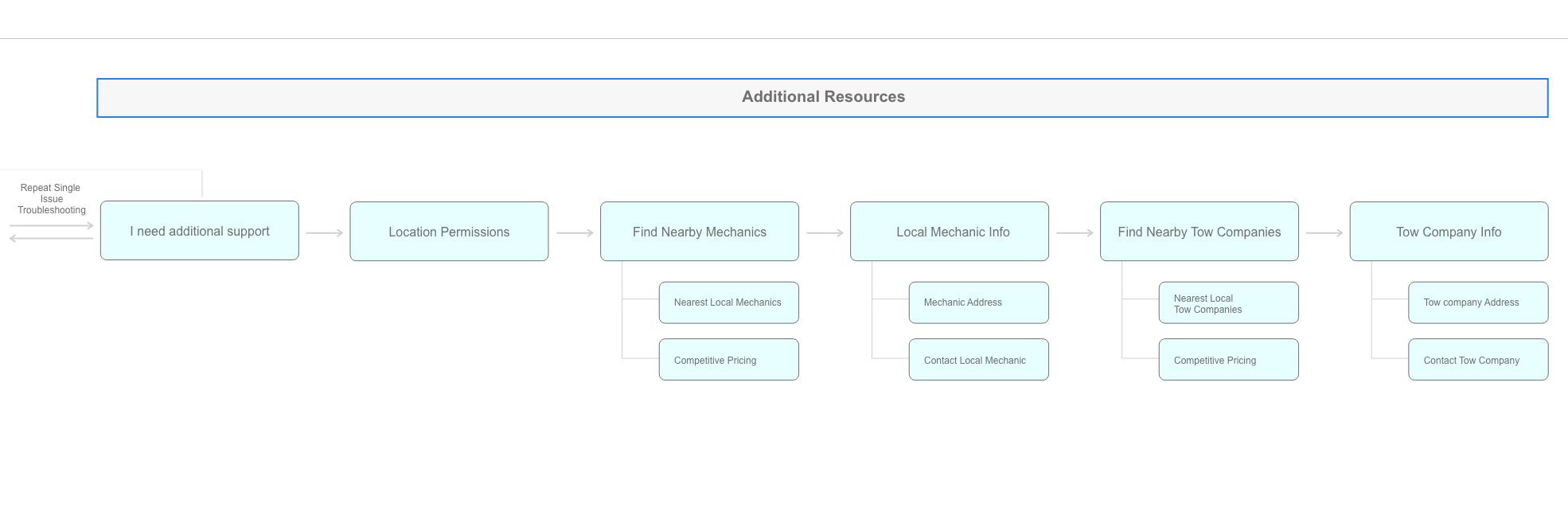
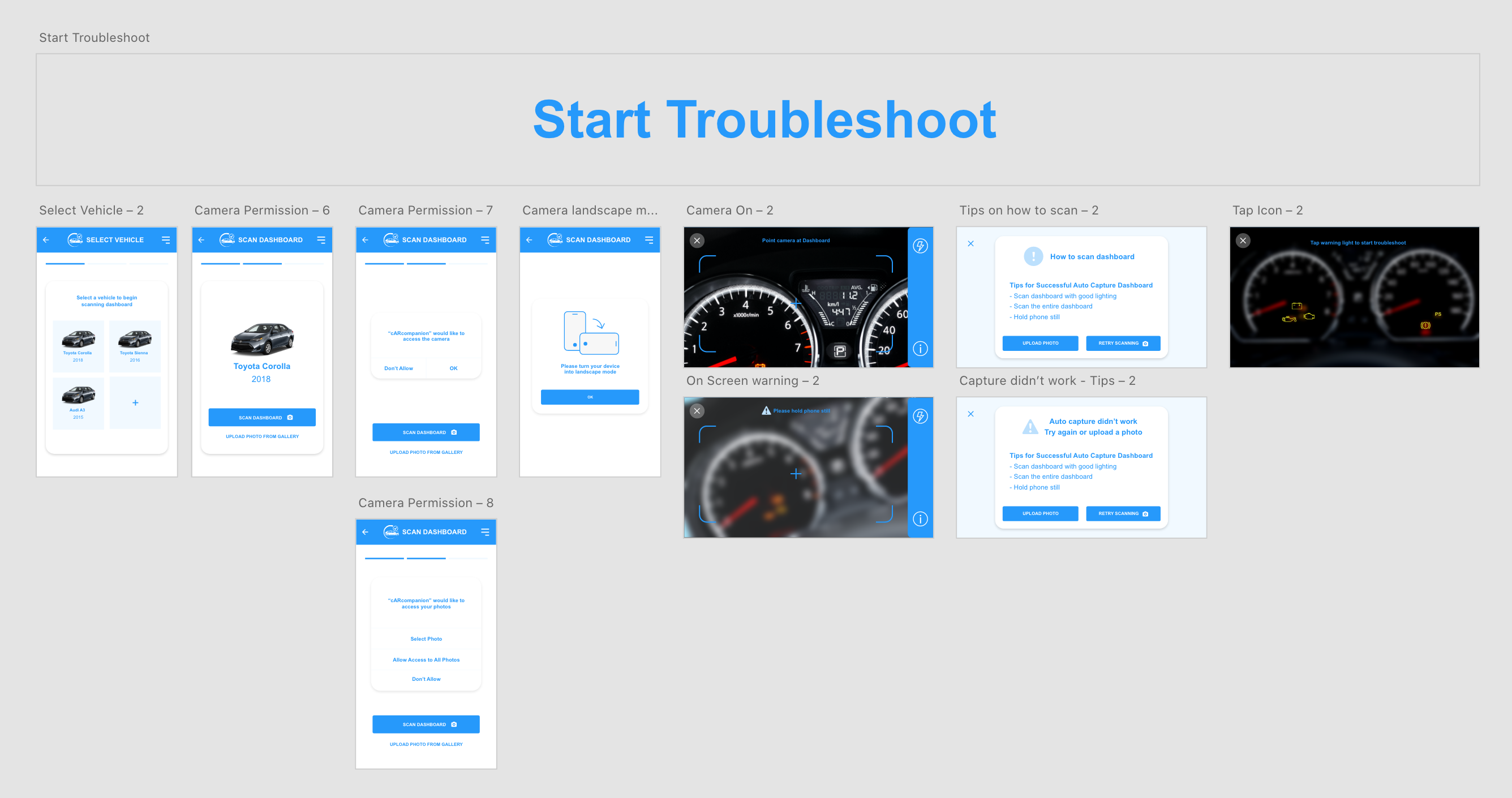
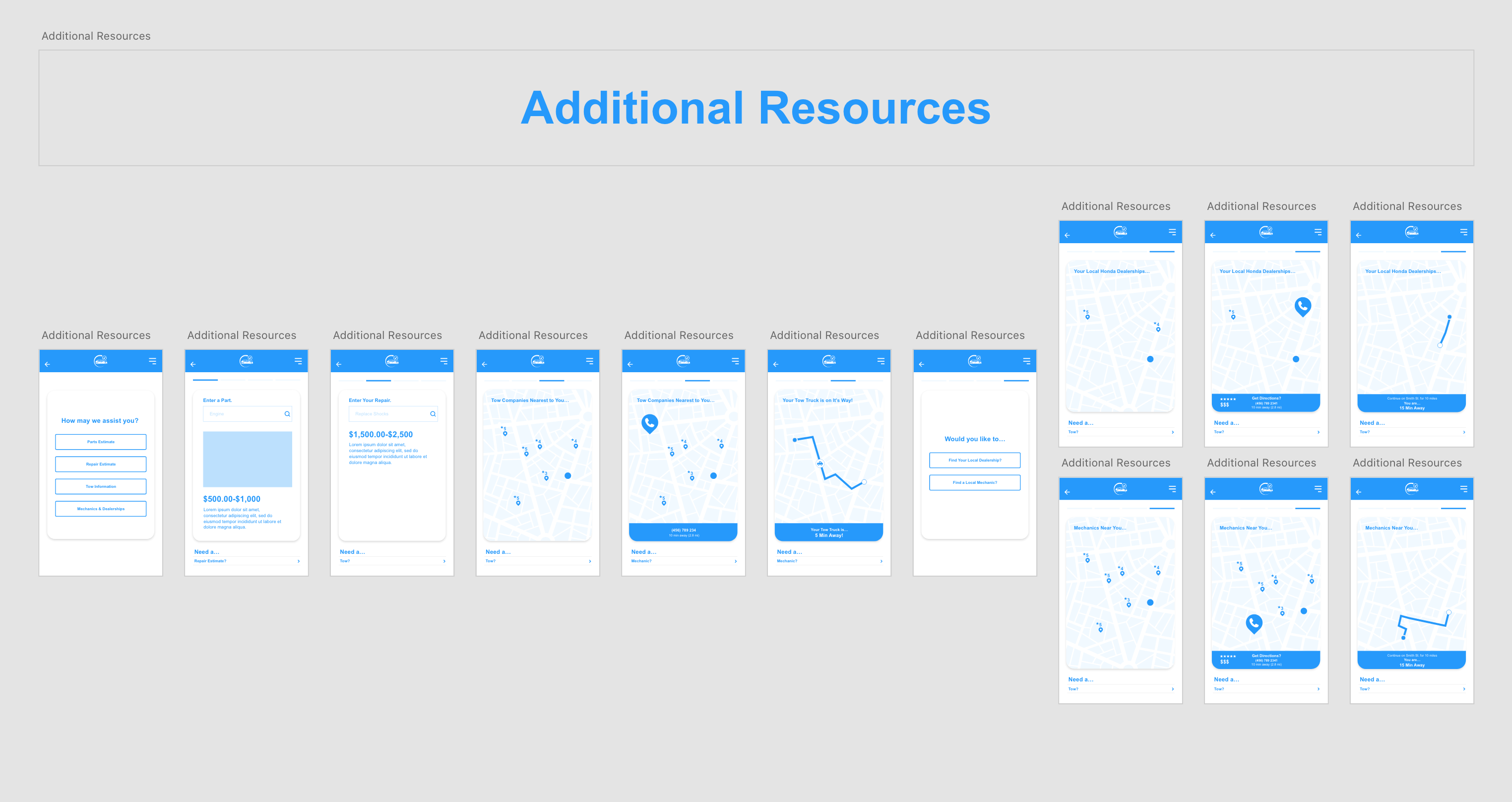
Product Workflows
Workflow helped diagnose gaps and overlaps. Our team worked on several revisions and landed on the workflow shown.
High-level Workflows
Workflow helped diagnose gaps and overlaps. Our team worked on several revisions and landed on the workflow shown.
Login & Authentication >
Profile Setup >
Troubleshooting >
Additional Resource
Key Learning:
As we were mapping out the workflow, we dug deeper into how the user would interact with the app, and we realized that the AR hood scanning feature might not be feasible for MVP 1 and decided to hold off on that epic.
Design
After defining the product, we moved into the design phase. We made changes and refined our screens during this process, which further improved the app experience.
Sketching
Sketching allowed us quickly identify, discuss and filter ideas out.
Key Learning and achievements :
We generated 100+ sketches.
We voted on the best ideas.
Needed to create landscape view for scanning dashboard, since car dashboard is horizontal.
Helped us focus on task analysis and eliminate gaps in thinking.
Wireframing
Moving from paper to digital, we took our top ideas from the sketching session and created wireframes.
Key Learning and achievements :
Learned about the technical constraints.
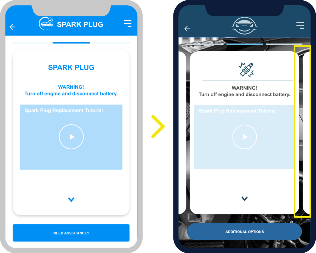
Reduced some of the words and added icons to improve clarity.
Added hamburger menu for future functions.
Design Considerations:
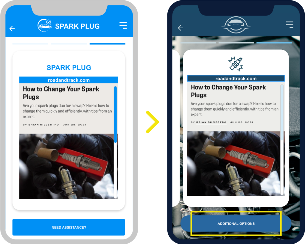
Google map integration
API
Bookmarking information
We learned from the user interviews that users like to use their social media. We can potentially add a sharing button for them to share their issues.
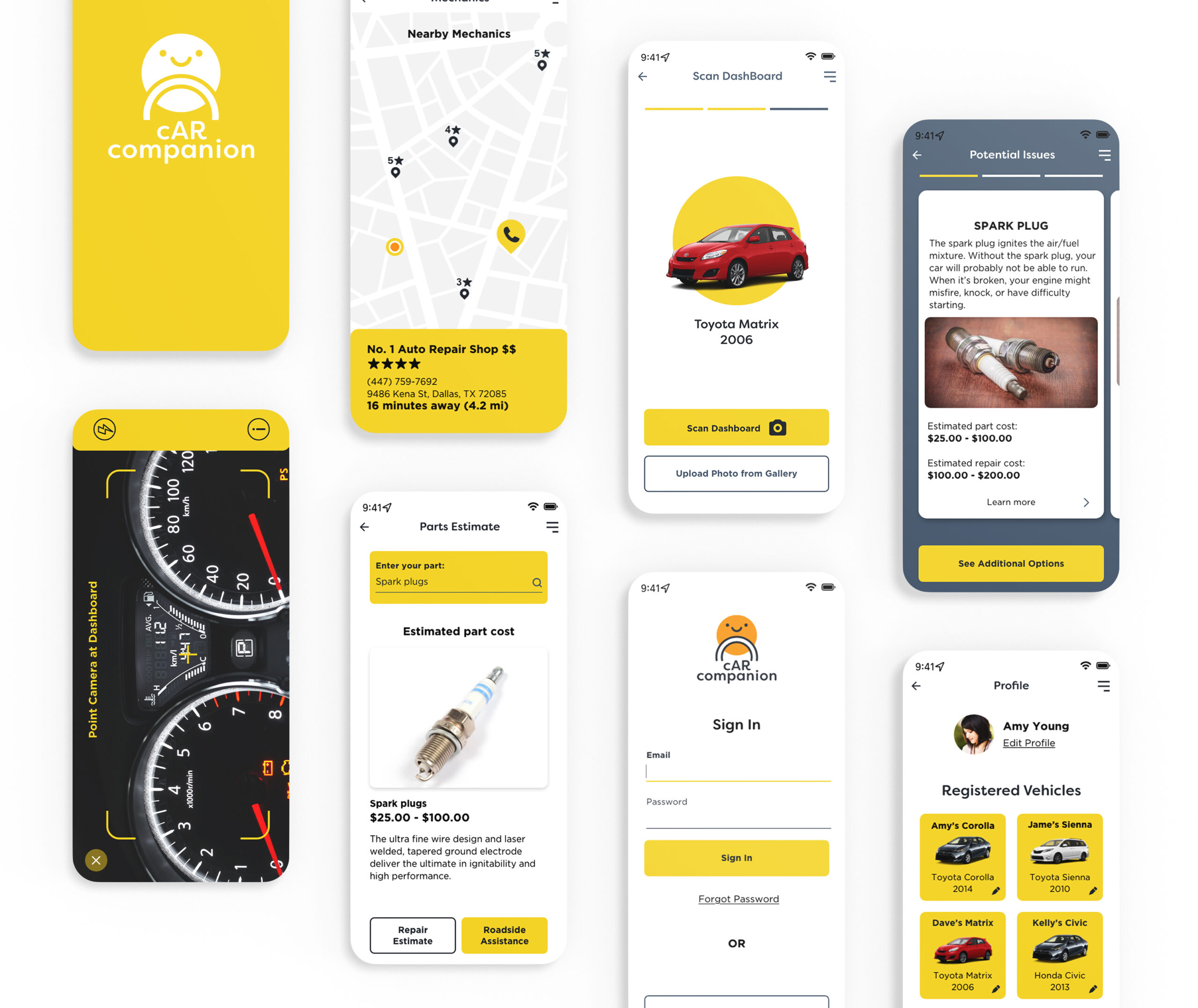
High-Fidelity Comps
The high fidelity comps captured the look and feel of the product, which made it easier to evaluate the product’s overall design and user experience
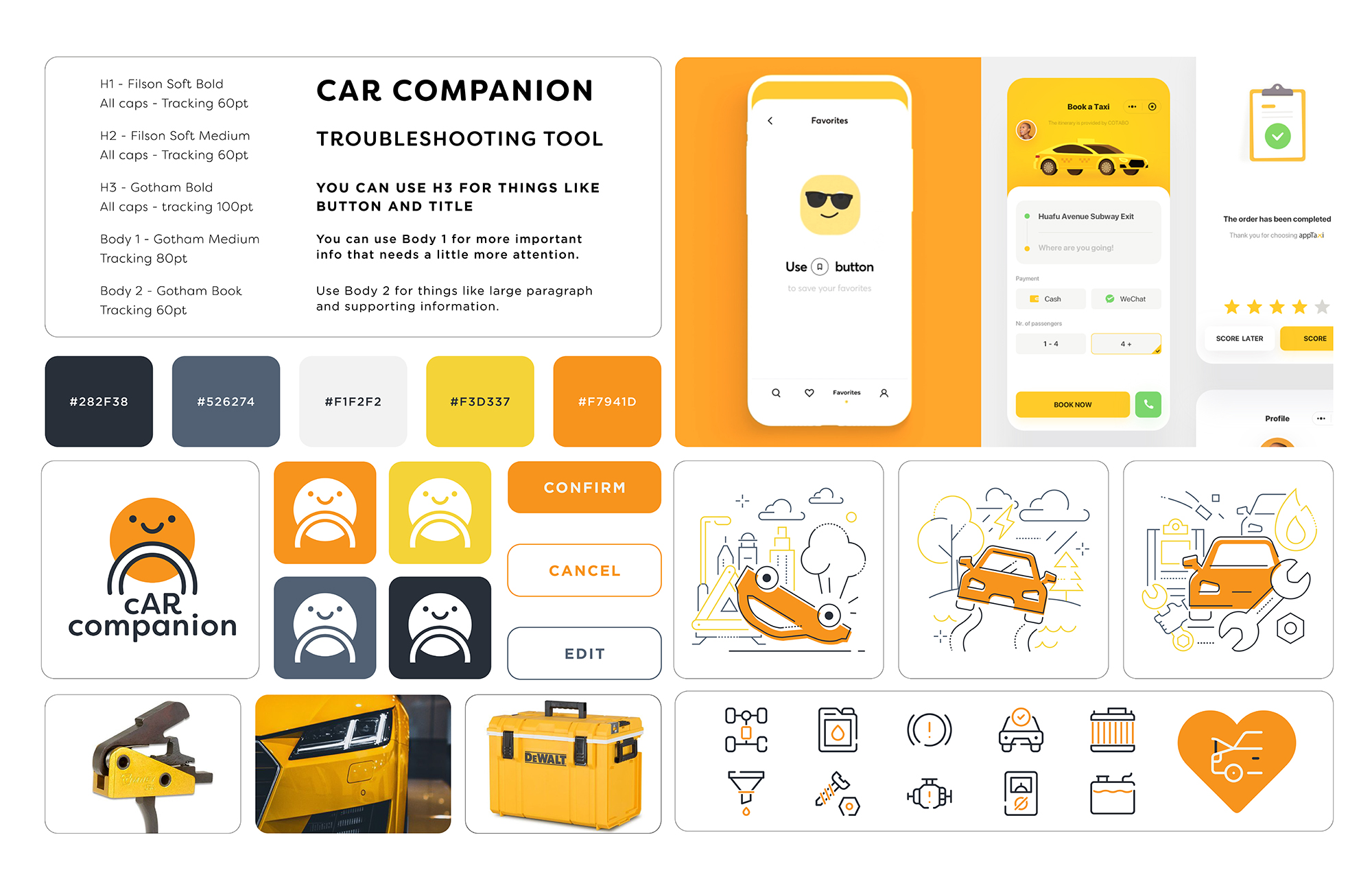
Branding
In color psychology, yellow and orange convey a friendly and uplighting mood. I came up with this mood board and branding theme in hopes of cheering up the frustrated drivers.
Usability Test
The main goal of usability test is to understand how users interact with the app and make changes based on the results.
Usability Testing
I conducted 5 usability tests to validate the design, ensure ease of use, and determine the users’ satisfaction with the product. The tests results were documented and organized for analysis.
I conducted 5 usability tests to validate the design, ensure ease of use, and determine the users’ satisfaction with the product. The tests results were documented and organized for analysis.